Wajda Centre for Film Culture
visual identity
(competition entry)
visual identity
(competition entry)
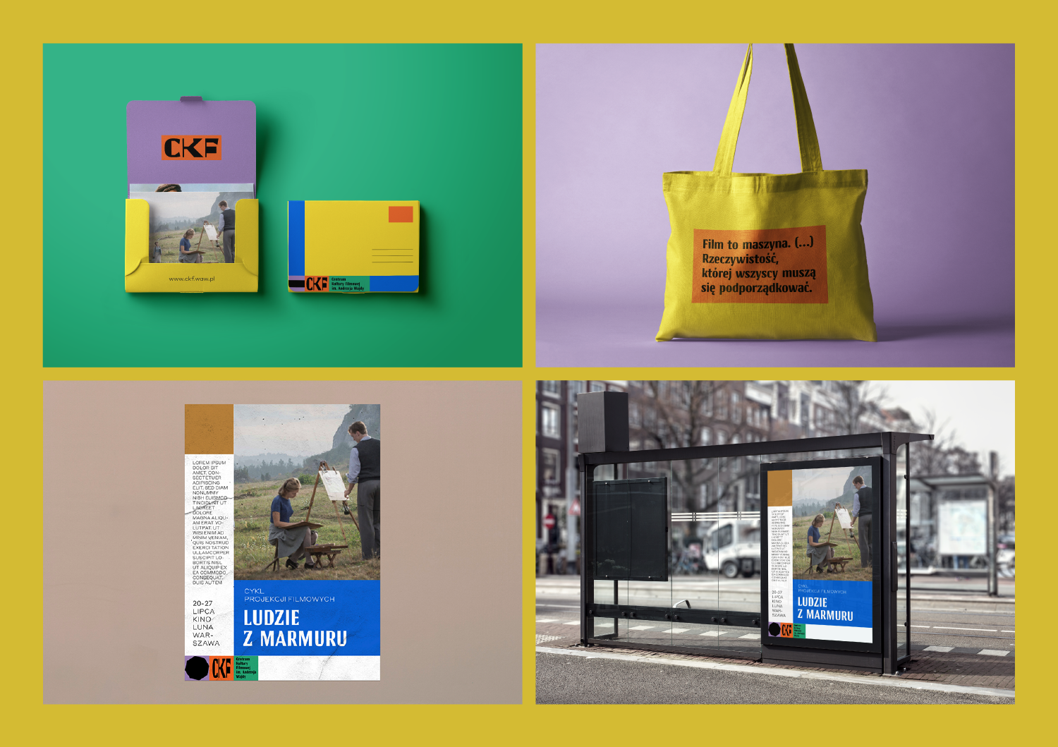
The challenge: A new cultural institution dedicated to Polish film heritage needed a visual identity that could hold serious institutional weight while flexing across departments, formats, and layouts—without feeling either stiff or generic.
The thinking: Grounded the system in Polish cinema's own character—stern but adaptable—using bold colour-blocking, strong typography, and mutating geometric shapes to give each department a distinct visual identity within one coherent system, right down to choosing a Polish-designed typeface Cyrulik inspired by historic Warsaw signage.
The result: A flexible, geometry-driven identity system spanning departments, stationery, publications, and outdoor signage—rooted in Polish design history at every level, from typeface to concept.