Notariuszki.com
visual identity
web design
illustration
visual identity
web design
illustration
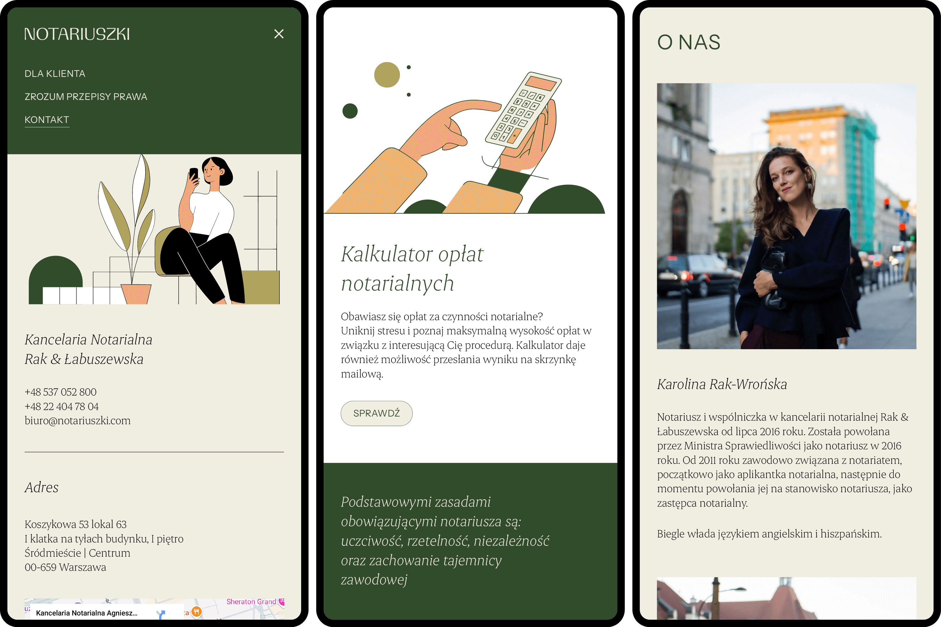
The challenge: One of Warsaw's first all-female notary firms—a practice actively working to demystify law rather than gatekeep it—needed a brand and site that read as trustworthy without falling back on the cold, formal visual language the profession defaults to.
The thinking: Built the identity and site around approachability without sacrificing authority—warm, feminine visual choices paired with clear, plain-language site structure, mirroring the firm's own approach of explaining law in human terms instead of legal jargon.
The result: A visual identity and website that match the firm's actual practice—accessible, professional, unintimidating—supporting their standing as one of the first Polish notaries publishing legal content for the public rather than behind it.
Visit the site ->
The thinking: Built the identity and site around approachability without sacrificing authority—warm, feminine visual choices paired with clear, plain-language site structure, mirroring the firm's own approach of explaining law in human terms instead of legal jargon.
The result: A visual identity and website that match the firm's actual practice—accessible, professional, unintimidating—supporting their standing as one of the first Polish notaries publishing legal content for the public rather than behind it.
Visit the site ->