International Puppetry Art Festival
visual identity
(competition entry)
visual identity
(competition entry)
The challenge: A festival built around puppetry's core premise—communication beyond language, through gesture and object—needed a visual identity that embodied that premise rather than just illustrating it, for one of the most respected events in its field worldwide.
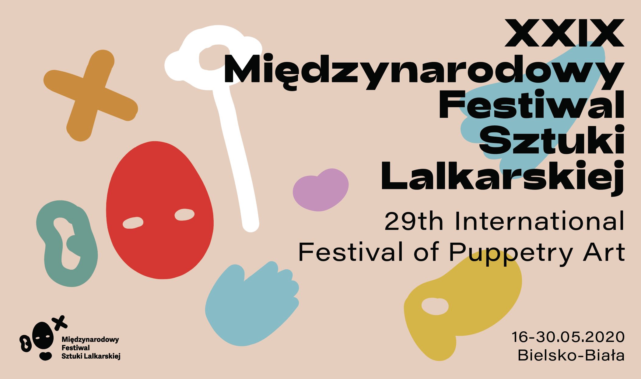
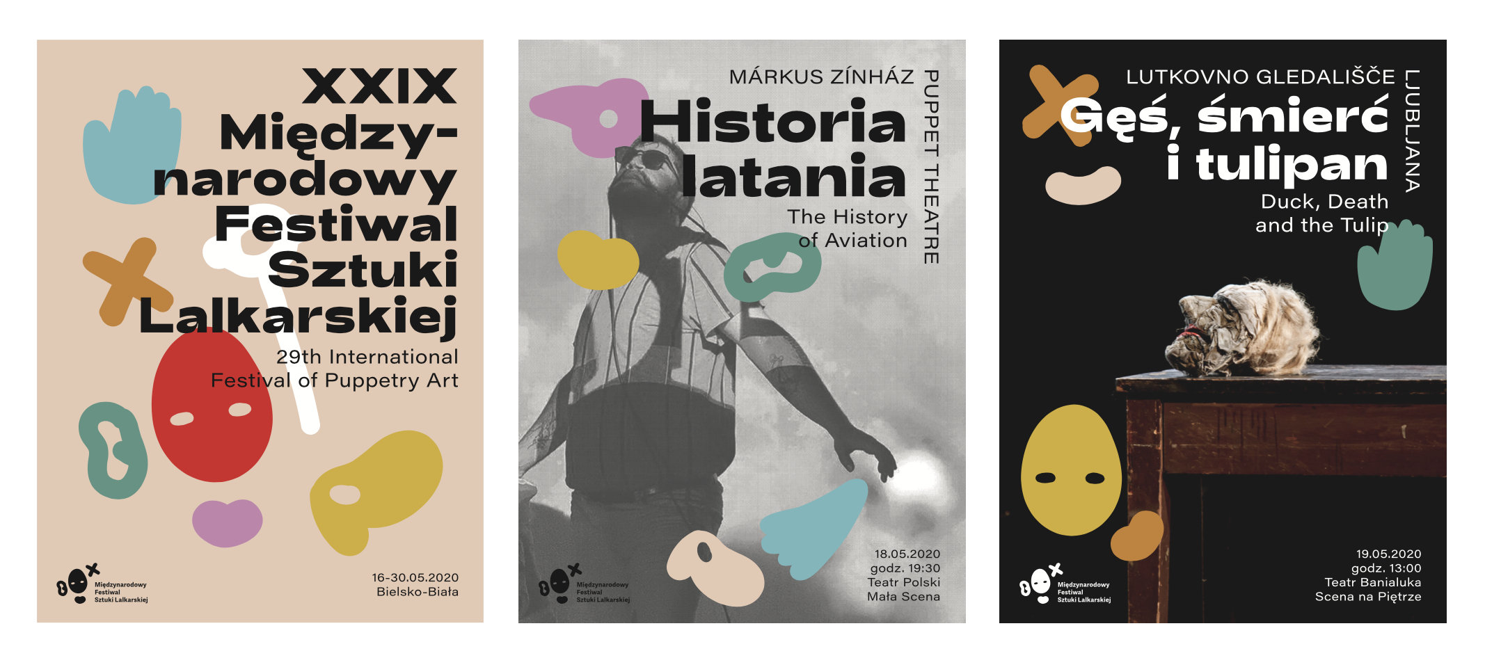
The thinking: Built the identity from a small vocabulary of crude, elemental icon-shapes instead of a typographic mark—deliberately unrefined, echoing puppetry's ancient, hand-made origins, so the logo itself communicated the way the festival's performers do: without needing translation.
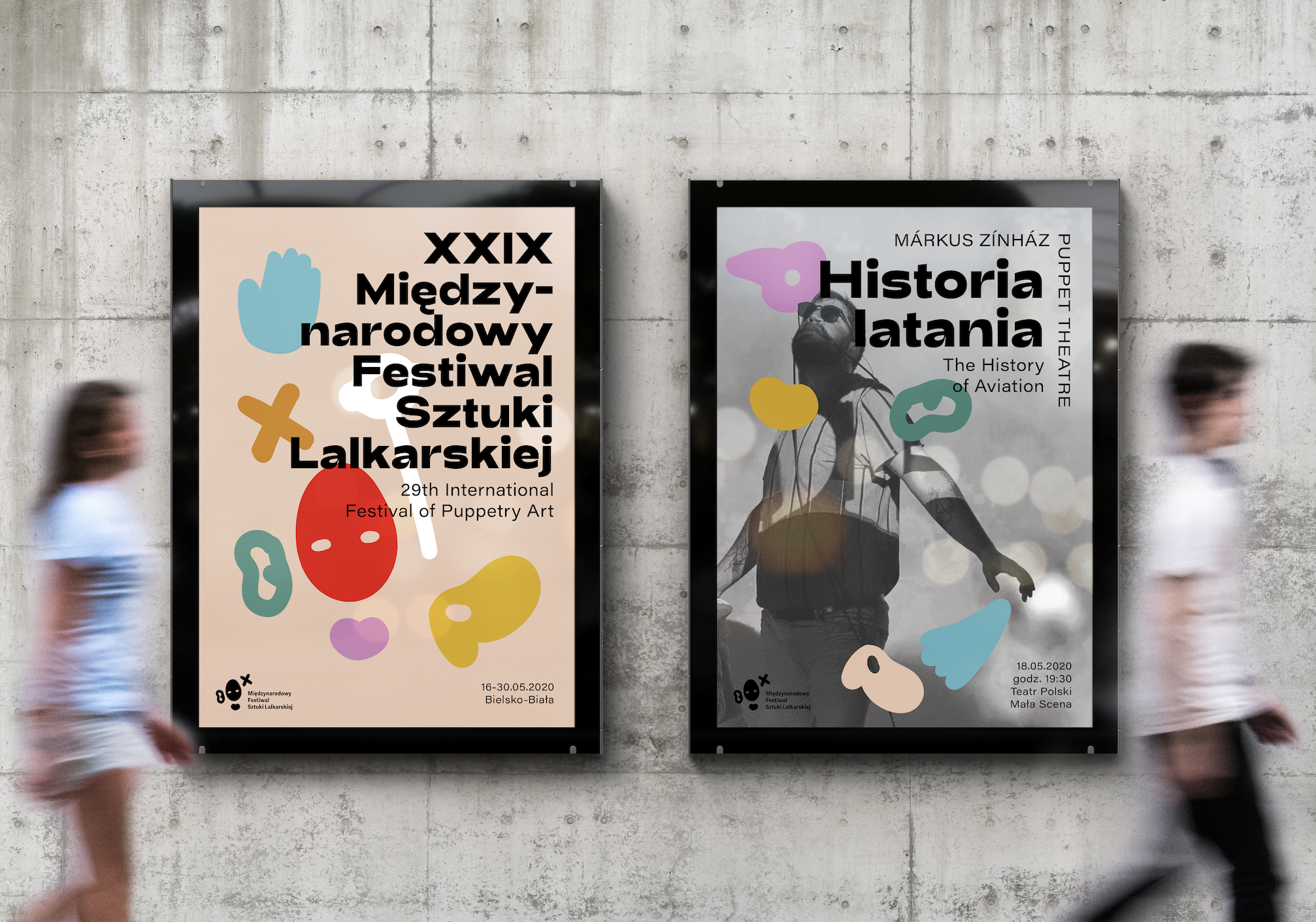
The result: A flexible icon-based identity system—posters, signage, merchandise, badges—that speaks the same "language beyond language" the festival exists to celebrate.
The thinking: Built the identity from a small vocabulary of crude, elemental icon-shapes instead of a typographic mark—deliberately unrefined, echoing puppetry's ancient, hand-made origins, so the logo itself communicated the way the festival's performers do: without needing translation.
The result: A flexible icon-based identity system—posters, signage, merchandise, badges—that speaks the same "language beyond language" the festival exists to celebrate.